 NEW YORK—What’s your favorite color? This is a question we’ve all answered at one time or another. And if we’re taking guesses, for New Yorkers it’s most likely 50 shades of black and for me, it’s always been pink. While colors can be a vehicle for self-expression and conveying emotion, how many of us can truly say we have a “signature” color?
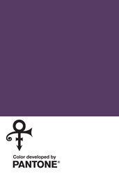
The artist formerly known as Prince—that’s who. The Pantone Color Institute solidified that for the iconic musician and artist with the creation of his custom color, Love Symbol #2.
Last month, the Color Institute debuted the standardized signature color inspired by Prince’s custom-made purple Yamaha piano. The color not only pays tribute to the “Purple One’s” mark on music, but also his lasting legacy on culture, art and fashion.
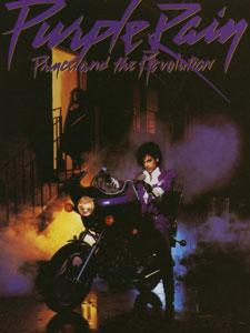
Prince’s association with the color purple was set into motion with the release of the film, Purple Rain in 1984 followed by the Academy Award-winning soundtrack featuring the eponymous song.
“The color purple was synonymous with who Prince was and will always be. This is an incredible way for his legacy to live on forever,” said Troy Carter, entertainment advisor to Prince’s Estate.
 Prince was well-known for challenging social norms not only through his music but through his personal style. Although he officially has a “signature” color, the spectrum of purple will undoubtably be used to honor his legacy.
“We are honored to have worked on the development of Love Symbol #2, a distinctive new purple shade created in memory of Prince, the ‘Purple One,’” said Laurie Pressman, vice president of the Pantone Color Institute. “A musical icon known for his artistic brilliance, Love Symbol #2 is emblematic of Prince’s distinctive style. Long associated with the purple family, Love Symbol #2 enables Prince’s unique purple shade to be consistently replicated and maintain the same iconic status as the man himself.”
The announcement of Love Symbol #2 is a seamless way to head into the fall/winter months as hues of purple take the front seat, leaving the summer’s bright tones behind. And with the release of Pantone’s Fashion Color Trend Report, we can all take a piece of the “Purple One” with us well into spring 2018 too.
The report showcases a palette that allows for bold statements as “the desire for colorful self-expression is a key take away for spring 2018.” So it’s no surprise that among the 12 call-out shades are Ultra Violet which “conveys originality and ingenuity” and Pink Lavender “that charms with its soothing sense of quiescence.”
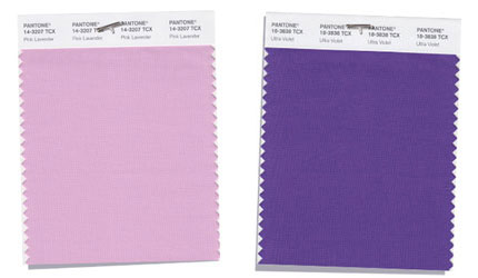
Among Pantone’s Spring 2018 top 12 color palette are Pink Lavender (l)
which is described as a soft, romantic velvet rose and Ultra Violet
which Pantone calls a distinctive and complex purple shade.
“Along with this recognized freedom to explore and experiment with more color, fashion and the people who interact with it, no longer want to feel limited by traditional color guidelines. Gender and seasonal borders continue to be non-issues when it comes to color,” the Pantone Color Institute stated.
It doesn’t get any more Prince than that. Now, put on your Raspberry Berets and Let’s Go Crazy as we get through this thing called life.